By Jeff Wooten
To provide commuters and passengers with better access to the Long Island Rail Road (LIRR) Main Concourse and New York City Transit subways, the Metropolitan Transportation Authority Construction and Development Company (MTA C&D) put together the recent design and build of the East End Gateway entrance at New York City’s Penn Station.
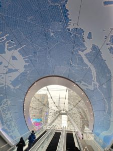
This towering glass and steel, A-frame canopy, located at 7th Avenue and 33rd Street, is an architecturally impressive achievement that now provides the LIRR Concourse with a “true entrance,” as multitudes of daily visitors now traverse its three state-of-the-art escalators and a stairwell.
The underside of the glass and steel canopy forms a compound curved shape, known as a “spandrel,” and the East End Gateway’s spandrel is composed of sixty individual steel panels of varying sizes.
However MTA C&D officials also wanted to find a way to incorporate an additional immersive, dramatic effect for this particular spandrel.
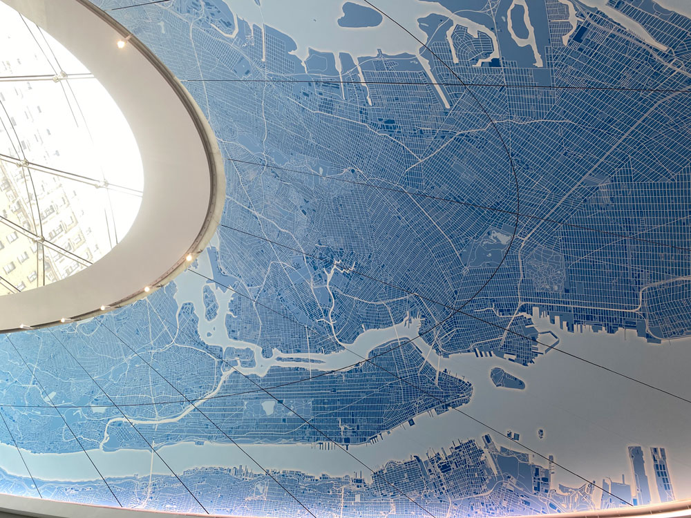
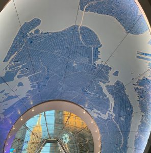
Their solution was to commission a spectacular, 1,988-square-foot map of metropolitan New York made up of sixty-five printed sections covering the East End Gateway spandrel that would enhance the experience as well as further brand the entrance. This massive interior graphic features detailed geographic information from West Point, down the Hudson River to Staten Island, and out to the Robert Moses Causeway on Long Island.
“When riding the escalator, there is the sensation of traveling through the interior of a three-dimensional painting, several stories high,” says Carol Smith, president and creative director of Creative Source, Inc., one of the companies involved in the design and installation of this experiential, transformative graphic illustration. (Note: See the sidebox below for all the companies that worked on this project).
Located in the heart of Manhattan, Creative Source, Inc., is a Women’s Business Enterprise (WBE) multi-disciplined design firm that has been around for thirty-five years. Their wide roster of clients includes Fortune 500 corporations, government agencies, and non-profit organizations.
“We design thoughtful, intelligent brand identities that are consistently articulated to support a brand—from its strategy, name, and logo throughout all marketing communications, including digital, PR, and social media,” says Smith. “Our success lies in our ability to create visual shorthand to convey a brand’s essence and then make sure [that] its unique personality is unswervingly articulated.”
Creative Source has enjoyed a long-standing relationship with the Metropolitan Transportation Authority (MTA). In fact, the company designed the iconic gold-and-blue MetroCard for the organization twenty-two years ago.
Global engineering consulting firm WSP USA was the prime consultant and program manager for this spandrel graphic project, and they brought Creative Source onboard as a sub for it. As part of the team, WSP also retained the implementation team from Duggal Visual Solutions for the client, MTA C&D. This team fostered a close collaboration from conceptual design through the completion of construction. Skanska USA, under the developer of the project (Vornado Realty Trust), implemented the construction utilizing Duggal as their sub. “Fortunately we’re accustomed to working on an integrated design team with multiple players,” says Smith.
Design + Build
Creative Source designers knew that they were going to need to come up with a dramatic design experience on the East End Gateway spandrel that would benefit the enormous size of the entrance. This funnel-like shape of the spandrel surrounds the 72-1/2-foot-long escalators (with a vertical rise of 29-1/2-feet) and stairway, between the shoulders of adjoining arches and the ceiling above.
“Above the spandrel is a ‘bright and welcoming’ glass and steel canopy,” says Smith, noting that this architectural motif not only introduces natural light into the station environment but also offers a prime view of the iconic Empire State Building.
The company drew up two design choices at the project’s onset. The first featured a map of Manhattan and the five boroughs, while the other displayed the greater metropolitan area. The MTA C&D selected this latter design because of its aesthetic composition and its inclusivity for most of Penn Station’s ridership.
To create the selected map design, Creative Source based it off a satellite view of the greater New York City Metropolitan area. They also used portions of the surrounding suburbs of Long Island and Westchester extending around the sides and encompassing a portion of the LIRR ridership communities.
The design had to accommodate the double compound curve of the Spandrel’s surface to include as much of the region as possible without distorting the image. Mena Henry from the Duggal team (Proptogroup) explains, “A map is defined as a ‘diagrammatic representation of the earth’s surface.’ The keyword is ‘representation’, since the earth is round, and maps are flat.
“This has always been the ultimate challenge for mapmakers around the world, because any 2D representation of the earth’s spherical surface is inevitably a distortion—an imperfect attempt to flatten the three-dimensional world we live in.”

The design team went through several different iterations of how “zoomed in” or “zoomed out” the scale of the map should be. “All the moving pieces had to constantly be balanced and readjusted to ensure the integrity of the finished product, as any changes to the scale or the complex lighting design had cascading impacts to the color palette,” says Anthony Delimitros of SPA International, a company that also shares office space with Creative Sources, Inc.
Creative Source developed dozens of blue palette variations designed to ensure the piece would “pop” and provide passengers with a “wow” factor as they enter or exit.
The Creative Source team was already facing a tight schedule to finish this project on time and on budget, but throw the COVID-19 pandemic into the mix, and they faced unique challenges related to scheduling and “mapping out” logistics. Not only were rigorous protocols and safety measures implemented to protect their team, but social distancing and travel restrictions added even more difficult hurdles to the requisite on-site planning process.
“Despite the inability to meet the team in person, we remained on schedule,” says Smith. “The team held regular virtual meetings. We had to be creative with our use of photography and software to show how various iterations of the design might look from different distances and under changing lighting scenarios.”
“The gigantic size of the graphic file required us to utilize a super computer, in order to handle the amount of detail needed,” says Delimitros.
Even with all the tight COVID protocols in place, the different teams involved in this project were still able to fabricate and install a physical mock-up of the design that Creative Source came up with for viewing at Duggal’s Brooklyn, New York facility.
Creative Source designers ended up mapping the tri-state area onto a flat plane with design and fabrication studio Proptogroup remapping that representation onto a doubly curved parabolic surface using UV mapping.
“When the UV mapping system is successfully projected on a 3D surface using 3D modeling software, it allows for the manipulation of the final visual field while maintaining parametric relations,” says Henry. “This means that the spatial relationships between Penn Station and the Brooklyn Bridge and Coney Island, for example, are all preserved.”
Duggal Visual Solutions has tremendous experience fabricating and installing large-scale graphics, and they explored and tested several different methods for fabrication. Each varied in terms of cost, durability, ease of installation, feasibility for curved surfaces, and the ability to show visual detail.
WSP USA, SPA International, and Creative Source researched several methods including the use of special paint with custom stencils, dye-sublimation printing onto metal sheets, and printing onto film.
“Every detail was vetted and discussed with the team—including the size, shape, color, and position of the fasteners to make them as invisible as possible,” says Smith. “The goal was to create an iconic graphic that is cost effective and durable without compromising the visual integrity of the design.”
The East End Gateway spandrel at Penn Station is composed of sixty individual steel panels of varying sizes. The map graphics were printed onto 3M Envision Wrap Film LX480mC because of its durability, while a matte laminate adds extra UV protection to them.
 “Special care was taken during printing and production to match the colors on each panel exactly,” says Smith. “Installation was carefully executed by matching the position of the graphics precisely on each panel.”
The teams involved also had to take into account the sheer volume of commuter traffic passing through Penn Station. On a typical pre-pandemic day, this equates to 650,000 passengers. “Using an innovative design-build approach, construction was completed without train service disruption and minimal impact to the overall passenger experience,” confirms Smith.
Experiencing the Reaction
The end-result has been awe-inspiring, taking this ceiling to another level.
Smith notes that its colors and graphic style create a powerful, modern design aesthetic at the 33rd Street entrance. “For visitors just arriving at Penn Station, the map serves to welcome them to New York as they ascend up into the city via the new entrance,” she says. “For departing passengers, it depicts the greater region and popular commuter destinations.”
This East End Gateway project also served as a beacon to the New York spirit as well, as it was also dedicated during a ceremony last December to the essential workers who depended on the region’s mass transit system and those who kept it moving.
All Photos: Creative Source, Inc.
The post On the Map: Penn Station’s New Spandrel Graphics appeared first on Sign Builder Illustrated, The How-To Sign Industry Magazine.
https://goo.gl/hYDEHJ
No comments:
Post a Comment