I FIND THE SHOW Ancient Aliens interesting, not because I believe in the aliens as described by the guy with weird hair and other “ancient astronaut theorists.” No, it’s because I’m interested in the sites allegedly involving alien technology or intervention — ancient monuments all over the world, intact to this day, that required quarrying, transporting, lifting and shaping stones of 20 tons and heavier.

‘Weird hair’ claims aliens, who appeared as gods to our early ancestors, helped construct them. “Mainstream science” — as it’s so derided on that show — says, short of convincing evidence for aliens, that mortal men and women built those monuments. How? No one knows. Why? Because people have always done what is important to them, and building monuments has always been important to people.
Every monument sign evokes a shape, a feeling and the statement made by those ancient human achievements and continuing to this day: This place is important.
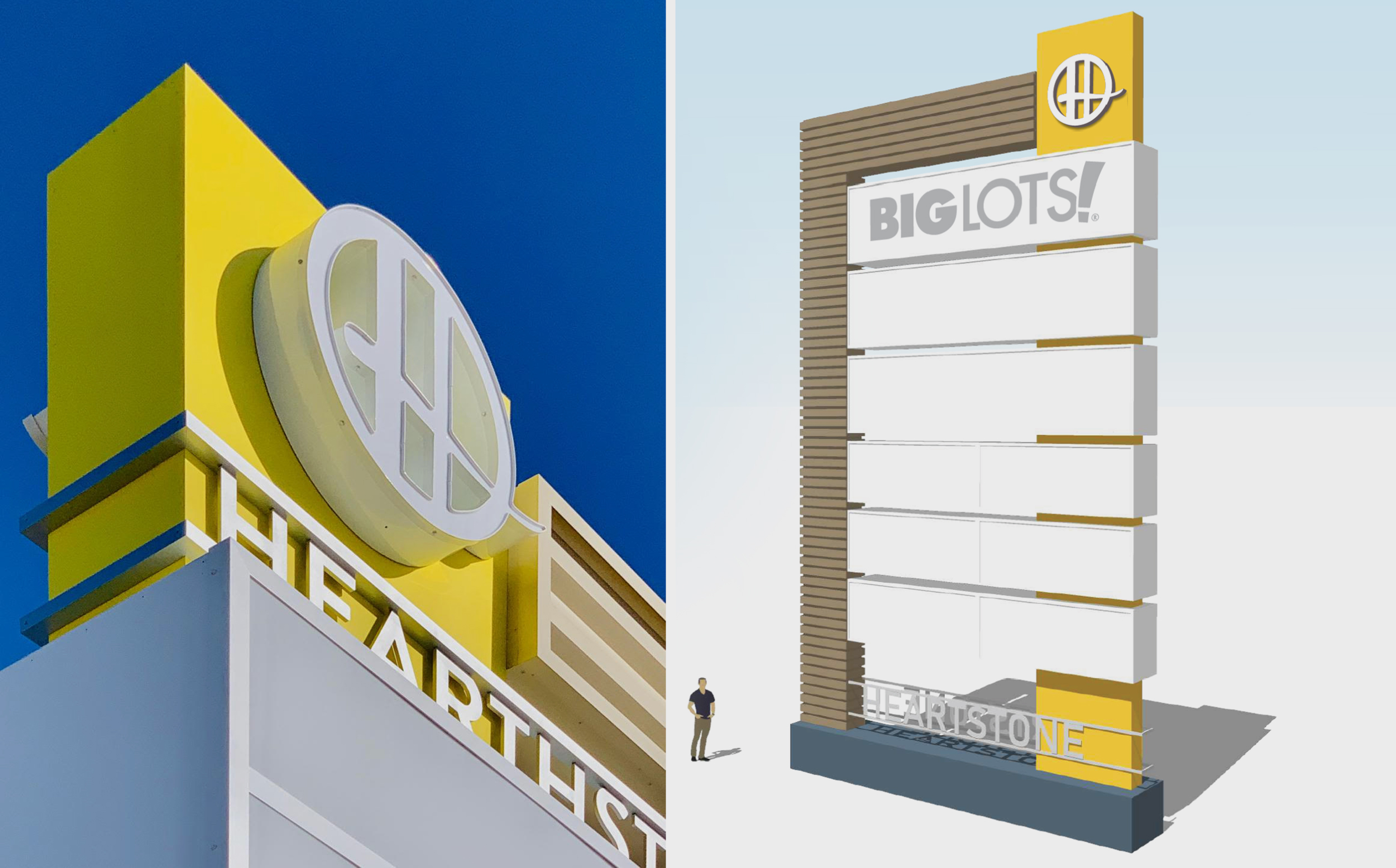
Ezzi Signs (Houston) approached a nearby shopping center, and sold them a four-monument package, which included a new logo to complete the rebranding.
WHERE THE HEARTHSTONE IS
 |
|---|
| Company Name: Ezzi Signs Designer: Ramon Arciniega Iii Fabricator: Jaime Juarez |
Few things must be cooler for sign companies than approaching a potential customer in their own neighborhood, convincing them to update their signs, then creating a new logo out of nothing, rebranding the new client in the process. That’s exactly what Ezzi Signs (Houston) did with commercial real estate company Brixmor Property Group, owner of Hearthstone Corners, a neighboring retail center whose four existing monument signs of various sizes and lacking distinction had suffered extensive wear and tear over the years, according to Ramon Arciniega III, creative director for Ezzi Signs.
The job, sold by Ezzi Sign’s Hussain Contractor, called for updating four multi-tenant pylon monuments, but to repurpose the existing supports. Arciniega started this design by hand, sketching ideas on paper, then moving onto CorelDRAW for architectural plans and SketchUp for 3D renderings. He also created the retail center’s logo. “[The client] did not provide anything other than the name in the concept phase, so I created the ‘H’ logo and chose a font,” Arciniega said. Pleased with the design, Brixmor chose to make it the main logo for the retail center. The entire design process required eight months with a total of six revisions.
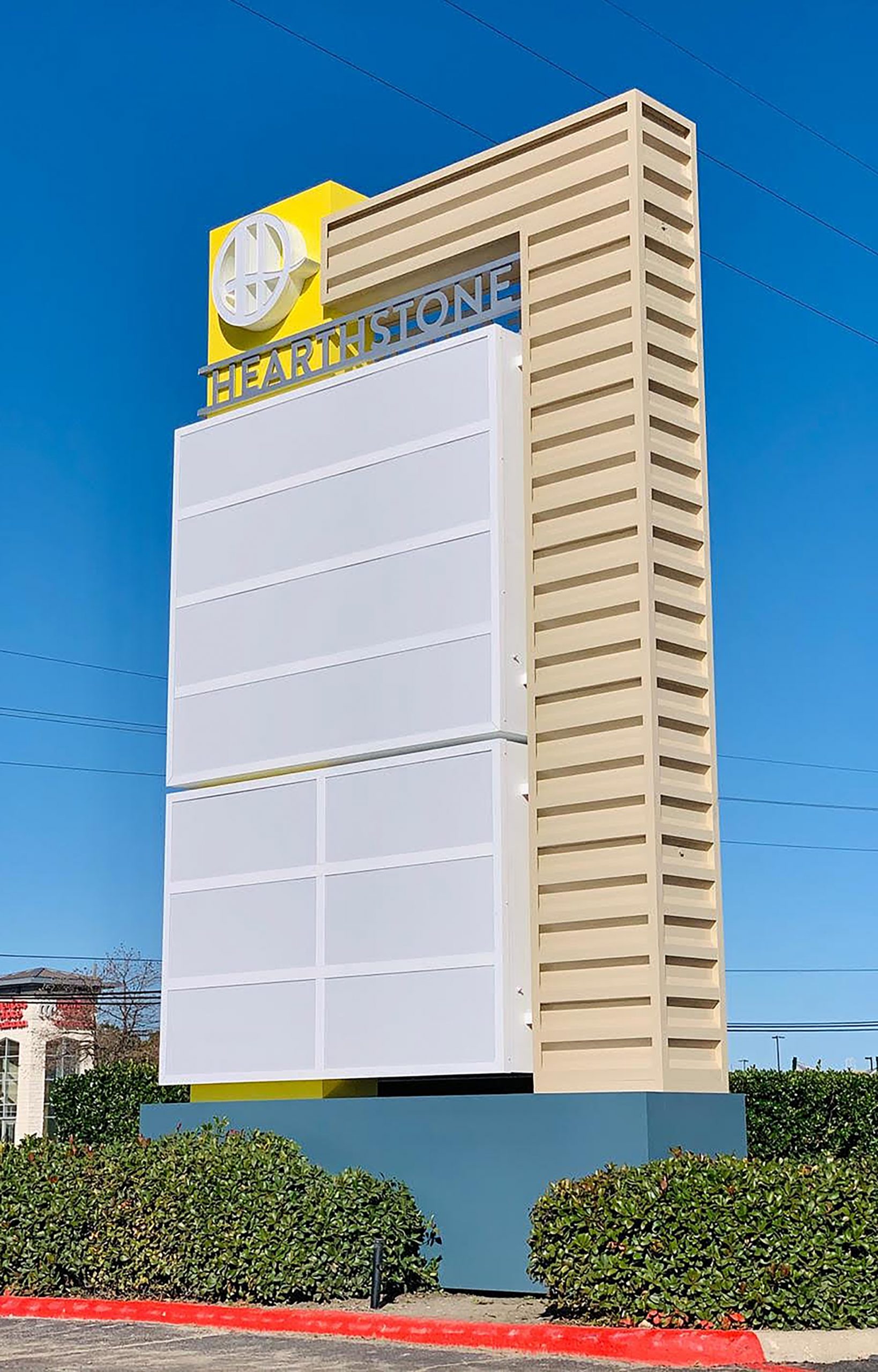
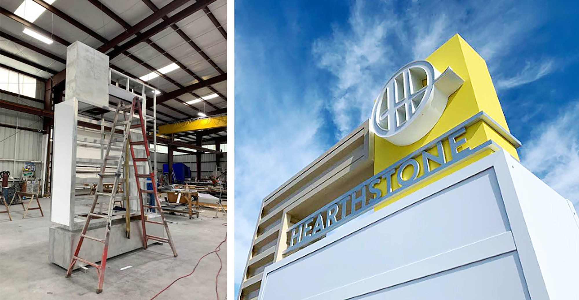
The four new, double-sided monuments would include more design elements, such as the side opposite of and connected to the logo, which bends at a right angle and acts as a ribbed spine from which the tenant signs are slotted. The spine also features a color to help both it and the white-background tenant signs stand out from each other.
With a permit from the City of Houston in hand, Ezzi Signs’ Jaime Juarez then set to work fabricating the four monument signs, which range in size from as small as 8 ft. wide by 12 ft. tall to as large as 24.5 ft. wide by 46 ft. tall. The illuminated logos are typical, 5-in.-deep, aluminum-coil channel letters with white acrylic faces, 1-in. white trim and white returns. The “Hearthstone” letters are ⅜-in. flat cutout aluminum letters on 1 x 1-in. aluminum tubing, painted silver with Matthews Paint. Ezzi Signs also used 3M vinyl, their Cescar router to cut the aluminum, and SloanLED modules for illumination.
Installation was challenging, Arciniega said, because they faced re-using existing pole supports, which were skewed and close to power lines. “We solved that [problem] by cutting several of the existing support structures a few feet above grade and shifting them horizontally by adding a perpendicular support between the two supports,” he said. Aided by the company’s Wilkie Model 72R and Model 52XLR cranes, a four-person crew installed the four signs in four weeks.
“The goal for this project was to improve [this] outdated retail center design, attract new clients and tenants to the shopping center, and to modernize the area,” Arciniega said. “The overall outcome led to working ahead of schedule, new referrals, and extremely pleased clients.”
CREATIVE CONSTRUCTION
 |
|---|
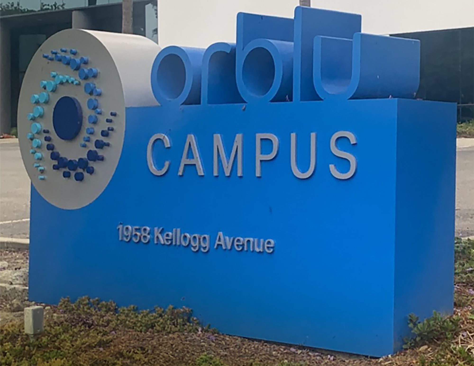
| This monument sign by Signs for San Diego (Oceanside, CA) features a hybrid of fabricated/welded and push-through acrylic letters. |
| Company Name: SIGNS FOR SAN DIEGO Designer: Christina Ciardella Fabricators: Alvero Espasa, Travis McCarty and Santiago Tabares |
“Our future biopharma manufacturing facility is located in Carlsbad, CA — strategically placed in the heart of the Southern California biotech cluster,” reads a portion of the home page for the Orblu Biopharma Campus. With a business and location like that, you know a unique monument sign has to be prescribed. And though a local Fastsigns sold the sign, Signs for San Diego (Oceanside, CA) was tasked to fill that order by building a monument sign featuring “an interesting construction,” said Frank Murch, owner. “We do most of the electrical and large signs for several Fastsigns,” he added.
Signs for San Diego builds a number of monument signs on an annual basis, both directly for end-user customers as well as for other sign companies without the ability to make them. “For the company buying a monument sign, [it is] a business tool. The purpose is to sell the services and products of our client. It is also a wayfinding piece,” Murch said.
While the client provided the design, as is often the case for sign companies, Signs for San Diego had to “reverse-engineer” the artwork used for business cards and letterhead into something “manufacture-able,” Murch said. His design team used Corel software, and produced three revisions over a two-week design phase.
Now, back to that “interesting construction.” Murch described the Orblu monument sign as a “hybrid between fabricated letters (welded letters), a sign cabinet and push-through acrylic.” The blend is unique and attracts attention, Murch continued, “making the Orblu monument the best business tool of its kind in the area. Customers and clients remember the company with a positive impression.”
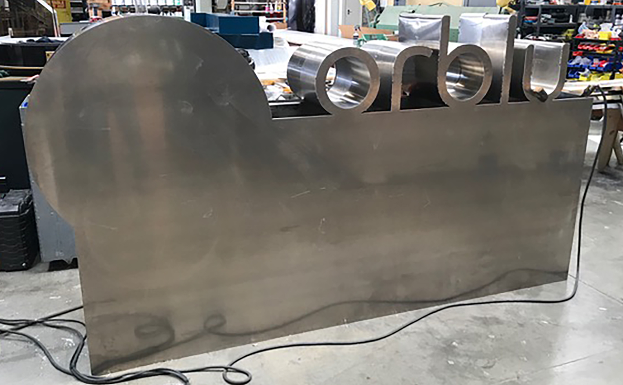
The sign, which measures 106 in. wide x 55 in. tall x 14 in. deep, features letters on top of .090 aluminum. The lower area combines acrylic and vinyl. “It [has] an aluminum square-tube frame, with .090 sheet aluminum sheet [for] skins,” Murch said. “The letters are [MultiCam] CNC-routed faces, with tack-welded points followed by a two-part epoxy. The pattern for the acrylic is routed in a large number of small parts, matching a push-through.” Signs for San Diego’s fabrication department shaped the letters by hand and welded them with a Millermatic 350P Aluminum MIG. For the interior lighting, they fitted HanleyLED modules and power supplies.
An installation team of two took 32 hours to install the biopharma campus monument sign on a concrete pad with a steel pole and a 6-ft. hole. No rebar was required. The dig and the pour lasted a day; mounting the sign using a Garland crane took another day.
“With the local city ordinance and the sign policy for the location and size, type and location largely settled,” Murch said, “the only way to differentiate our products from all others is to build more interesting signs.”
GALAXY QUEST
 |
|---|
| Company Name: FASTSIGNS Designers: Ethan La Pan and Melanie Hossler Fabricator: Direct Sign Wholesale, Raleigh, NC |
Another Fastsigns that outsources its monument-sign fabrication is Fastsigns of Augusta in Augusta, GA. Fastsigns’ client, Galaxy, who, along with Sampson’s, are subsidiaries of S. Lichtenberg & Co., a manufacturer of window treatments for home and bathroom applications distributed through Walmart, Kohl’s, Target, Amazon and other retailers. Galaxy recently rebranded and Fastsigns of Augusta delivered a new monument sign and a lobby logo for them.
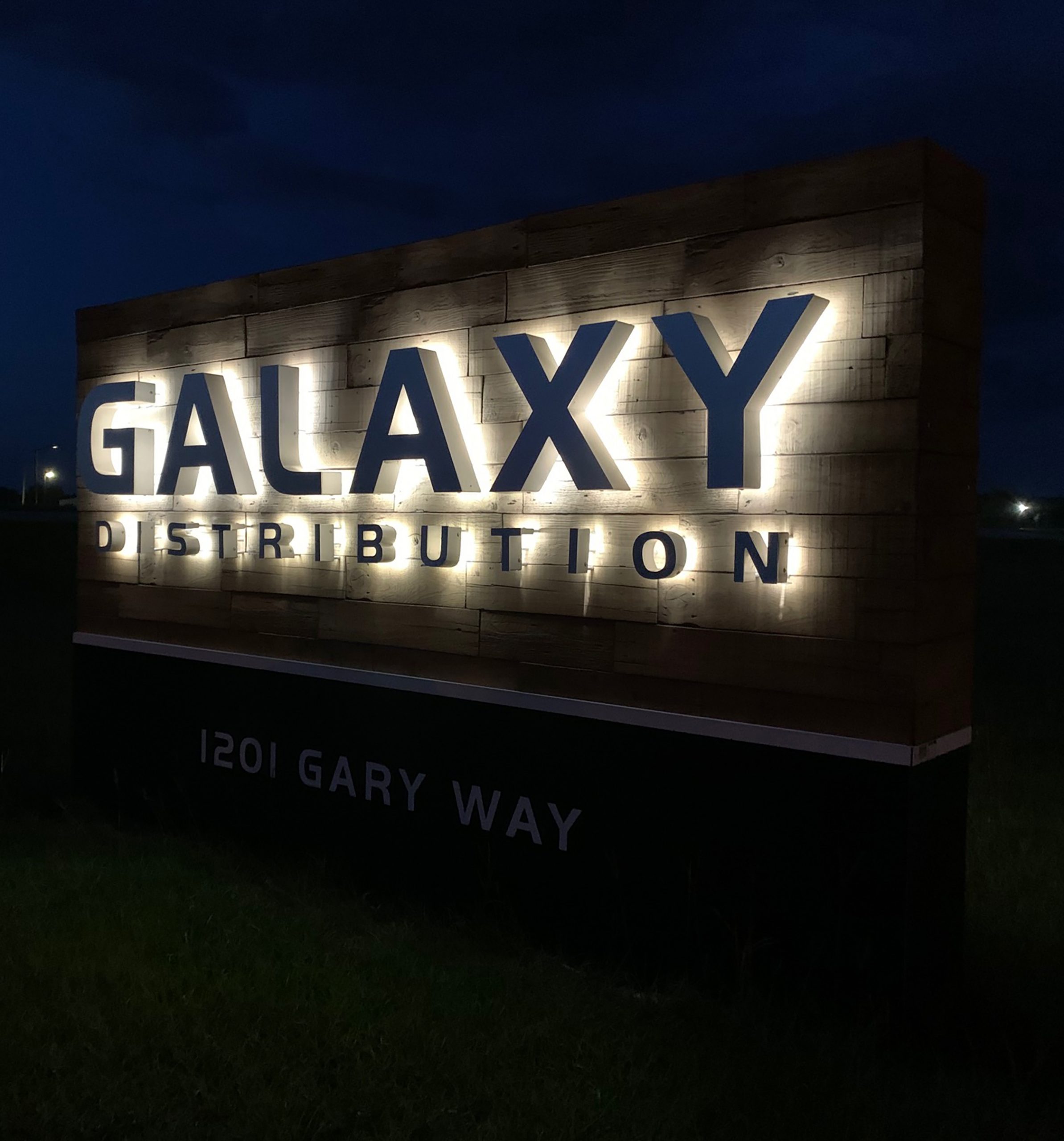
“We have done small jobs here and there for them starting in 1994,” Melvin D. La Pan, owner of Fastsigns of Augusta, said of Galaxy. “The client likes the look of wood,” he said. “They have wood in their main lobby and wanted to mirror that for the monument.” La Pan advised against using real wood in the monument sign, so the client settled on a faux wood/polymer urethane product from Texture Plus with a 25-year limited warranty.
The client had created the logo and provided Fastsigns of Augusta with the font names. La Pan’s designer then set it up as a vector file, and used Adobe Illustrator and Photoshop to design and proof out the monument. “We went through 3-4 rounds or proofs before settling on this design,” La Pan said.
Direct Wholesale Sign’s King’s Mountain, NC location fabricated the sign with LED-lit, reverse channel letters, which comprise painted .063 aluminum with .040 brushed aluminum faces. The skirt is a standard aluminum construction painted black, with vinyl address numbers. The sign measures 10 ft. across by 6 ft. high.
Fastsigns of Augusta used their hydraulic auger to excavate the holes and mixed their own concrete to set the poles. “We had to relocate some power, so a mini-excavator was used for that,” La Pan said. Four people removed the old sign and installed the new monument over two days.
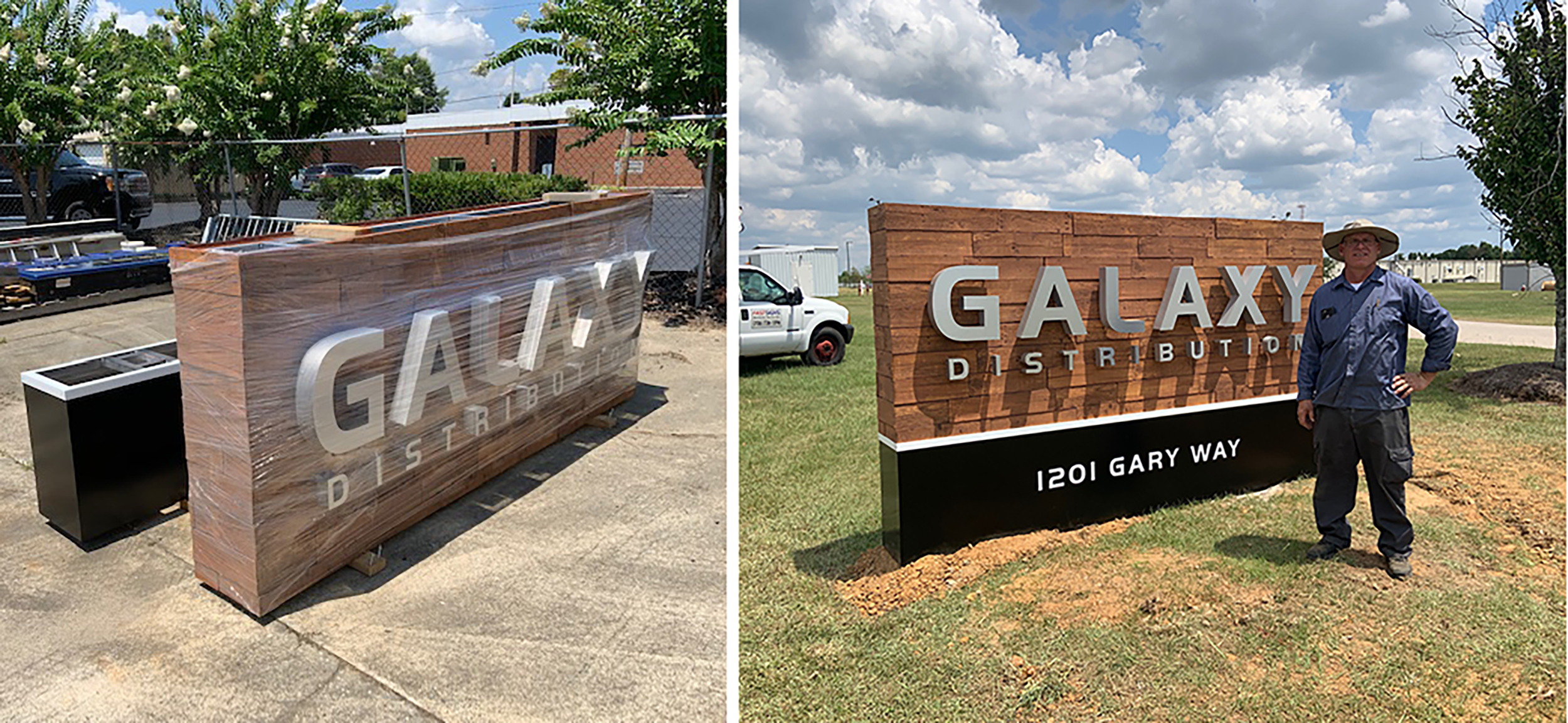
Fastsigns of Augusta’s (GA) client Galaxy liked the look of wood, which Fastsigns achieved with a faux-wood product that could last up to 25 years. The reverse channel letters and fabrication were provided by Direct Sign Wholesale (Raleigh, NC).
The installation concluded without incident, but two months later, La Pan’s Fastsigns received a call saying some of the letters were not lighting. “We went out to inspect and determined the sign had been run into by a large lawn mower. We had to replace/adjust some of the letters,” La Pan said, adding, “I am not 100% certain, but I believe the lawn-care man was fired.”
But was he really a lawn care man or was he … an alien from another galaxy? Ancient astronaut theorists say, “Yes!”
The post Monument Signs Mark the Significance of Their Places appeared first on Signs of the Times.
https://goo.gl/hYDEHJ
No comments:
Post a Comment