What are the best fonts to use on signage? Which font is easiest to read? To find the answers to these questions and more, we decided to survey our team of professional graphic designers (who have collectively designed thousands of signs) to see what they consider to be the best fonts for sign making. While some may consider a question like this to be completely subjective, there is no denying that there are universally accepted design principles to consider when picking the fonts to use on your signage. Some fonts look better on a large sign and some work better on a small sign. Some fonts may look great digitally but not turn out as great when printed on a physical sign.. Picking the best font for your signage can be a bit complicated and overwhelming, so we compiled all of the info you need in this article.
Best fonts for signs
First off, let’s give you the answer to the question: What are the best fonts for signs? For most general large-format signs, our designers recommend using any of the following fonts:
- Helvetica
- Futura
- Bebas
- Avenir
- Proxima Nova
Now, it does not necessarily mean that if the font you choose is different than these five then it is a bad font. Who knows, it may have been ranked number six! These were simply the most common answers that we discovered from our survey. So let’s dig into why those fonts work so well for sign fonts.
Side note: Our designers also revealed their bottom 3 fonts to use for signs, which are the following:
- Comic Sans
- Papyrus
- Any script font
Steer clear of these fonts if you want to have a professional sign and have it be readable. For a bit of design humor, check out this video from an SNL skit about the Papyrus font.
Most people first use fonts in school, using a word processor like Microsoft Word or Google Docs. Due to that fact, many people think the default fonts used by those programs, such as Times New Roman and Arial, are the only fonts out there. That is simply not the case. Did you know that there are hundreds of thousands of fonts? Most of them can be downloaded or purchased, then installed for you to use.
Any font that is natively in a tool like Microsoft Word or Adobe Illustrator is actually being licensed by the company that owns the tool. That is why we think they are “free”, but unfortunately they are not necessarily free for everyone. Keep cost in mind when exploring fonts. Many fonts are very similar, and can substitute each other. It is typically worth it to purchase an expensive font if you want to use it on your website or across your brand consistently.
Can you pick what font works best?
Let’s take a look at what 4 different signs look like with the same exact design, but with different fonts.
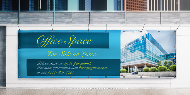

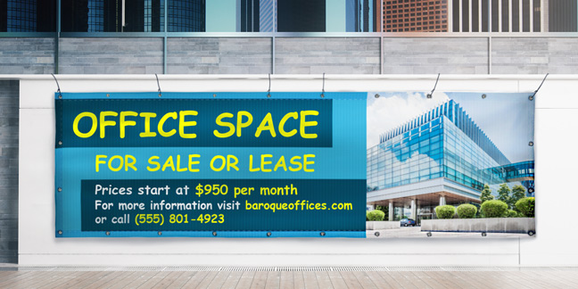
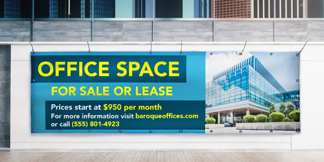
So what banner uses the best font? If you answered image D then you are correct! When it comes to image D, it uses a sans serif bold font for maximum visibility and readability. Images A and C are wrong because script fonts and comic sans are difficult to read and look unprofessional. What about image B? It does not look terrible, but it uses a serif font, which is more appropriate for small format. If none of those terms make sense yet, don’t worry! We will go into greater depth throughout this blog post on why image D was the best one for this situation.
Font Categories
Fonts generally fall into a handful of categories. Common categories include serif, sans serif, script and cursive, text and novelty. If you would like more information on each of these categories, check out our blog post about font categories. Continue reading this article if you want specific reasons that you should or shouldn’t use certain font types. We will explain in this article that sans serif fonts are typically the best types of fonts to use for large signage. Sans serif fonts are also suitable for smaller formats and prints. We will also explore why script and novelty fonts should typically be avoided.
Keep in mind that the difference between serif and sans serif fonts has to do with the serifs. Serifs are small lines at the end of characters. So serif fonts have serifs, and sans serif fonts do not. The difference is clear between Times New Roman (serif) and Helvetica (sans serif).
Digital vs Print Fonts
We live in a largely digital world. There is so much work going on day to day on different computers and devices. Something that can often be forgotten is how popular physically printed signs are in the world still. Take a look around your town as you are walking or driving. You will notice that printed signs are still everywhere and not going anywhere. The great thing about digital design is that it makes designing and creating physical signs incredibly easy! Anyone can use a computer to design a sign.
Here are some font tips to remember when creating and designing for a printed sign. Fonts used for printed signage need to be easily legible, and thick enough for printing. This is because sign printing equipment for certain sign types can have issues with text that is too thin. Thicker fonts will help to ensure that your sign is clear, visible and turns out printing the way you intend it to. Digital fonts can have a variety of thicknesses and still look crisp, but for a large, printed sign it is best to have thick fonts and text.
Something else that is often forgotten, however, is that things don’t always look great on both digital and print. There are some fonts that look better on a computer than they do when printed. For example, digital screens can show thinner fonts in a more visually appealing way than a printed sign. Another example is that you have a lot of variety and freedom when on a computer, and it can be easy to go overboard on fonts. While comic sans or papyrus fonts may look fun on your screen, they are typically not viewed positively when printed. Please keep that in mind when designing.
Best Font Tips for Large Format Signs

Large format signs are the banners, aluminum, plastic, and flag type signs on Signs.com. Generally speaking, most signs that are meant to be displayed and not picked up and looked at are considered large format. Sans serif fonts will be the king of font families to consider when designing your large format sign. Arial, Helvetica and Bebas are all great optoins. Our designers also recommend making text big, bold and dark (on a light background) for the best readability.
Ultimately, the reason we even consider which font is best revolves around readability. Ask yourself, what is the easiest font to read? If you are going to invest in a nice, big and beautiful sign, you surely want it to serve its purpose. That can only happen if it is readable from a viewable distance. The best way to make sure your sign is readable from different distances is to remember that a sign typically has 10 feet of viewing distance for every inch of letter height on the sign. So if the text on your sign is 4 inches, that would make it readable for most people from about 40 feet away.
Best Font Tips for Small Format Signs
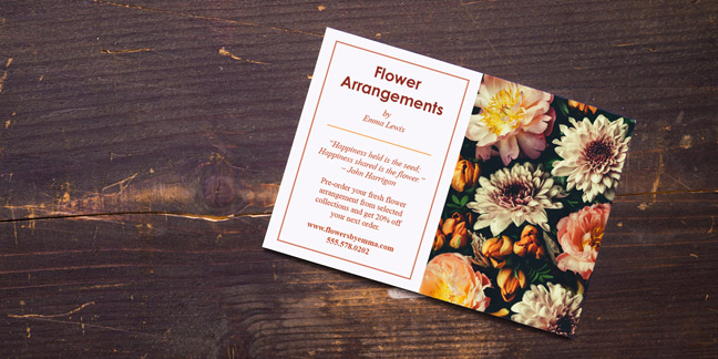
For small format signs, which include business cards, stickers, postcards, brochures and door hangers among other signs, you can use either serif or sans serif fonts. Our designers recommend using sans serif fonts for headings and large text. When it comes to smaller text and paragraphs you can use serif fonts at your discretion. Typically, formal businesses like law firms and government offices use serif fonts for their text. Other companies have used sans serif fonts for small type and it still looks good. It is up to you!
A few things to keep in mind when considering fonts for small format signs revolve around readability. Ask yourself again, what is the easiest font to read? Always remember that the classics are the classics for a reason. It is imperative that you don’t use comic sans or papyrus on small format type documents. Also, steer clear of all caps, scripts and grunge fonts with small format. It looks unprofessional, it is unreadable and it makes designers incredibly sad.
Best Colors For Easy to Read Fonts
When it comes to colors for your fonts and signs, there are a few important factors to keep in mind. Our designers recommend generally sticking to a black or dark grey font color with light backgrounds or a white font color with a dark background. If you stick to that, you can never go wrong. Other colors can work, but are typically more difficult to read. Red can work for some situations. Keep in mind that red adds a sense of urgency and emergency, so only use it when appropriate.
Another thing to consider is to only use colors that contrast well and are not similar in value. Colors like red and yellow are similar in value, and become difficult to read when on top of each other. Another thing to consider is if a color blind person can read the sign. There are many reasons why it is smart to stick to black, grey and white for your font colors.
Tips and Tricks for Using Bold Fonts
A good question to ask when considering the best fonts for signage is when and when not to use bold fonts. Something important to know up front is that not all fonts are bold. While word processors and design tools can make any font bold with the tools they offer, that doesn’t mean it is a bold font. It is best when using bold to find a bold version of the font you are using and use that bold version rather than toggling the bold B in the toolbar.
Our designers gave a list of some situations that make bold fonts pop. If a sign is difficult to read, bold may help. Using a bold font on a sign that needs a readability boost can always help, especially with large format signs. Black fonts and darker greys are typically the best-looking bold fonts. Bold fonts are also best suited for short and important statements of text. Things like “FOR SALE” and “Everything Must Go” are great situations to use a bold font or all caps. When you do decide to make a part of your sign bold, keep in mind that you don’t need to make the whole sign bold. Making the most important part of the sign bold can help that information pop off the page.
Best Professional Fonts
When designing an important sign for your business you may be asking yourself, “What are the best fonts to use that look professional?” This is a topic that has been explored a little bit in various parts of this blog post, but we’ll leave you with the answer here. Use classic and popular fonts to stay as professional as possible. Times New Roman, Arial and Helvetica are always business appropriate. Any of these could be the best fonts for posters, best fonts for political signs, best fonts for banners or for any other sign you wish to use to promote your business.
Don’t use anything that is too far from the standard fonts either. Using grunge, script fonts, or comic sans will never reflect well on your brand. Keep it simple and keep it classic to remain professional with your fonts.
If you would like someone who knows all of these design principles by heart to choose the font for you, one of the wonderful designers at Signs.com would love to help you out with that! Our professional designers will design anything you need for free. That means you won’t have to worry about all of these font tips and it won’t cost you anything to get the design made.Please contact us contact us if you have any questions or need help!
Summary of Tips for the Best Fonts From the Professional Designers at Signs.com
Keep the following five tips in mind when selecting the best fonts for sign making.
- The best fonts are the classics. The top five fonts selected by the design team at Signs.com include Helvetica, Futura, Beba, Avenir, Proxima Nova. Arial and times new roman are also great fonts to use. If you stick to any of those fonts, you will not have any issues.
- Stay away from Comic Sans, Papyrus, script, and grunge type fonts in most situations. If that isn’t very clear to you at this point in this post, please refer to this video now so that Ryan Gosling can tell you why.
- Don’t use more than three fonts on a single sign. This is something that we didn’t explore much in this article, but it is very important to remember. It can be tempting to use various different fonts when creating your design. The best practice for designing is that one or two fonts are enough. If you want to use a third font and feel it is necessary, it can be done. Three is still a bit much though. If you are tempted by a fourth font, it is too much. Don’t do it!
- White space is not your enemy! Keep this in mind as you design with fonts, images, and anything else you use. There is never a situation that will require you to fill every single inch of a design. Let there be white space, or blank space to keep your design balanced and let it breathe.
- Readability is always going to be the most important factor in choosing the best font. If you feel that your font is readable and that it looks good, have a friend or co-worker take a look. If they agree that it is readable and looks good, you will probably be fine with most fonts. Except for papyrus and comic sans, for obvious reasons if you have read to this point.
No comments:
Post a Comment