When we are building or prototyping a responsive website, we need to give the website a test in numerous viewport sizes to check to see if the layout and pages are displayed well. There are several ways in doing so: you can use Adobe Edge Inspect or a browser extension such as Dimensions for Chrome.
The problem is that these tools do not always work seamlessly in every case. Adobe Edge Inspect requires your laptop and mobile devices to be connected under the same wireless connection, XIP.io also requires your devices to connect to the Internet, and in my experience it is quite painful to debug responsive website under iframe or having to repeatedly resize the browser window.
Emulate Viewport Size
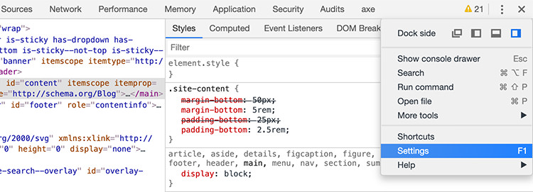
Chrome now comes with a built-in feature that allows you to emulate your site in many size of device screen and resolution. To enable it, open the Developer Tools Setting by navigating from the View > Developer > Developer Tools menu.

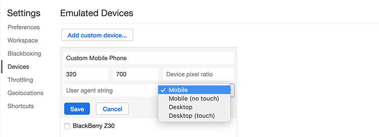
Head over to the Devices panel. Select Add custom device to add a custom viewport size, pixel ratio, and the user agent.

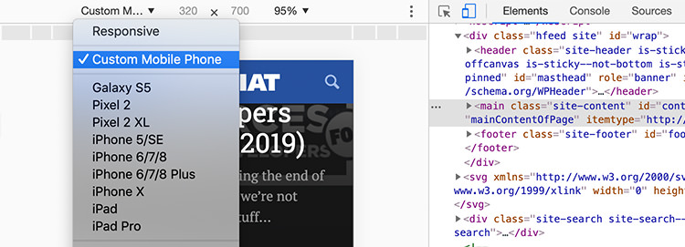
Now, the custom device we added will appear in the device selection as follows. Select it and you should see viewport changed instantly.

For the rest, you can find a complete list of mobile device viewport sizes in Screensiz.es.
Conclusion
Google Chrome has a lot of helpful features that can streamline the development process. Now, by using Chromes Device setting, you can debug your website for specific viewport size without having to deal with restricted connectivity, using third-party browser extensions, or trawling through an iframe.
The post Viewport Emulation with Chrome’s Device Metrics appeared first on Hongkiat.
https://goo.gl/hYDEHJ
No comments:
Post a Comment