When running for office, campaign signs might not be on the top of your to-do list. In this digital age we live in, do signs really make much of a difference in your campaign? Research shows that when they’re done right, signs can add a lot of value to your campaign. So how do you design a successful campaign sign? Read on, and we’ll show you.
Choosing The right Campaign Sign
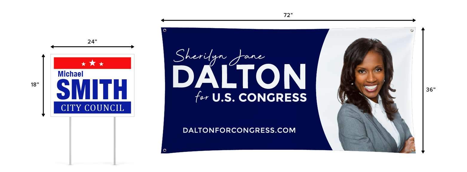
You might think that the standard 18” x 24” inch lawn sign is the only way to go, and while that’s a great option, it’s not the only one. Think about what you’re trying to accomplish with your campaign signage. A successful campaign involves designing the right signage and other print materials that ensure your name and the office you’re running for are easily seen and remembered.
If you’re looking for multiple locations at a low cost, you’ll want to go with a corrugated plastic yard sign. The reason so many campaigns go with the standard corrugated sign is that it’s cost effective and easy. If you want a high impact sign that’s a bit larger scale, choose a vinyl banner. You can also think about car magnets and window decals, as well as aluminum or wooden signs for something a little different. Check out our Campaign & Political Signs page for more ideas and details about the most popular large format campaign signs.
Along with large format campaign signs, you may also want to consider smaller print materials to supplement your campaign marketing. In municipalities and neighborhoods that allow it—flyers, door hangers, and even brochures are effective “in hand” materials that can help inform citizens about your platform.
You can also use small print materials for direct mail by using postcards. Bumperstickers can also be used and distributed to your supporters who are happy to show their loyalty and belief in your campaign.
Small format print materials:
Studies show that campaign signs work, and having lots of signs is a definite advantage. Whether you start off your campaign with a wide format sign, small format or any combination of campaign signs or prints – have fun with it! Choose some mediums that you are interested in and get your name out there.
Campaign Sign Sizes
When it comes to getting noticed, the bigger the better is usually the idea. However, where you are placing your sign can sometimes determine what size you’ll need. Here are some sign size parameters to keep in mind for your sign placement:
- Standby traffic (foot traffic or neighborhoods) 12” x 18” to 12” x 24”
- Medium traffic (35-45 mph areas) 24” x 32” to 24” x 38”
- Highway traffic (high speed or long distance) 32” x 48”
- Billboard (Long distance or high impact) 48” x 60” to 48” x 96”
In addition to these sign sizes, there are quite a few other forms of advertising signage that can grab attention for your campaign. Bulletins, also called billboards, come in a standard 15’ x 49’ or 14’ x 48’. There are also bus benches, posters, subway poster ads, and even bicycle taxi ads. While these forms of campaign advertisement are effective, they can also be costly. If you’re considering something along these lines, your best course of action is to first analyze your return on investment and then move on from there.
While 24” x 18” is the standard size for a yard sign, you’re definitely not limited to that size. You might even consider designing your yard signs slightly larger than 24” x 18” as the slight increase in size can make your signs “stand out” from the other local campaigns.
If a large banner is allowed in a certain location you’re eyeing, go right ahead! Sometimes there are restrictions on sign location and sizes, so be sure to check on that before posting a sign. We put together a handy list and interactive map to see what’s allowed in your state.
Design Elements to Consider
Color
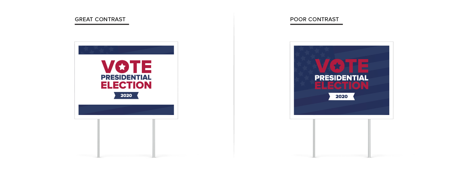
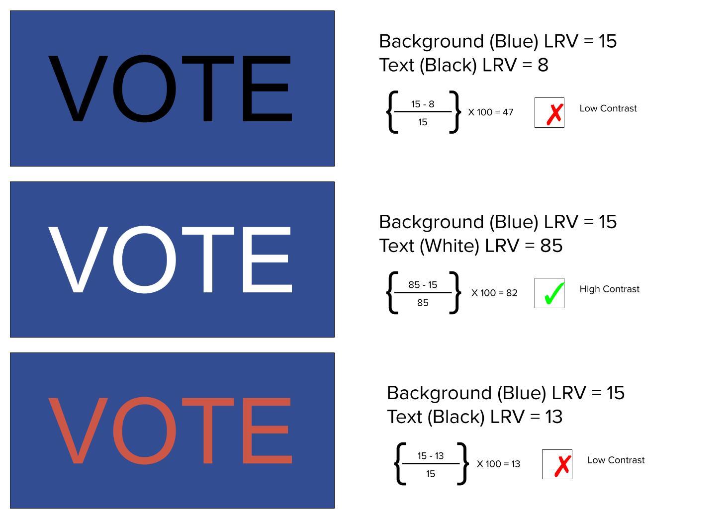
In most cases, red, white, and blue are standard, but if you’ve got a different color in mind, that’s perfectly fine. Make sure you use lettering that has high contrast with background colors, as it will be easier to read from a distance. You don’t want to pay to design, print, and place yard signs that are hard to read and are, therefore, ineffective. In the 1992 book Wayfinding, authors Arthur & Passini introduced a formula based on light reflectance value (LRV) to calculate the contrast between two colors—here is the formula:

Where K1 is the highest color value (lrv), K2 is the lowest color value (lrv) and H is the contrast value.
The industry standard for signage is that the contrast value between the background and the text of the sign should not be lower than 70. In other words, your contrast value (H) should be 70 or above.
Here’s an example to help illustrate this point a little better:
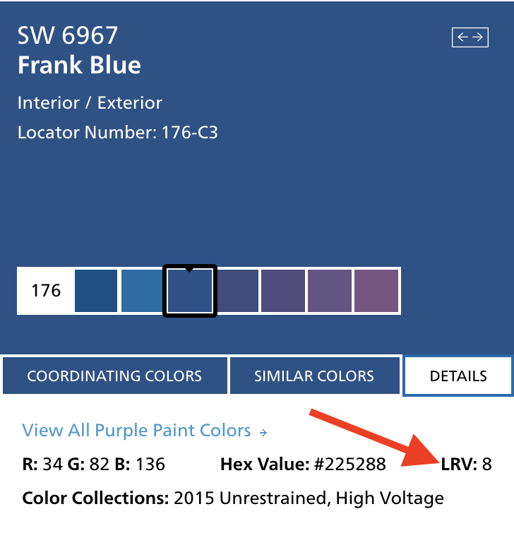
Based on this formula, you can identify which colors will work best for contrast and readability. A great place to find the LRV of a color is at a local paint store or online—the color swatch samples will have the LRV listed in the color details as shown here:
Color can be a tricky thing, so pay close attention to what will work and what won’t. Be sure to use text that has high contrast from the background of your sign and don’t get carried away with too many colors. For a more in-depth lesson on color, check out this post on signs.com.
Font
This can be tricky if you’re not careful. First, consider your size. The United States Sign Council Foundation has conducted studies on letter height and distance correlations. Their findings have shown that a 1” letter is visible from 30’ or less when driving, or 50’ or less when standing. Make sure your sign is readable according to the most common reading distance in your environment. Next, consider your font. Overly decorative fonts aren’t good for readability. Choose bold, easy to read fonts with minimal serifs.
| Easy to Read Fonts | Hard to Read Fonts |
|---|---|
| Verdana – Get out and vote! | Comic Sans MS – Get out and vote! |
| Helvetica – Get out and vote! | Cursive – Get out and vote! |
| Georgia – Get out and vote! | Impact – Get out and vote! |
| PT Sans – Get out and vote! | Courier New – Get out and vote! |
| Quicksand – Get out and vote! | Fantasy – Get out and vote! |
Content
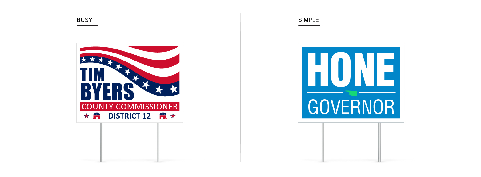
Less is more when it comes to campaign signs. Think of the absolute basic information your constituents need to know. These elements could include your name, position you are running for, and the area in which you are running. Sometimes, if you’ve got a particularly different name, you could use a catchphrase, but avoid too much wordage. Keep it simple.
Besides your text, you may want to add a few flourishes or shapes. Be careful with this! Too much can distract from your vital information. Lines, small shapes like stars or flags, and other flourishes can compliment a sign well, as long as they are placed cleanly, and evenly, not crammed in to take up more space. Because you’re dealing with a relatively small space, pictures, faces, or other images don’t usually work well. Even on large banners, it’s a good idea to stay away from photos.
Layout
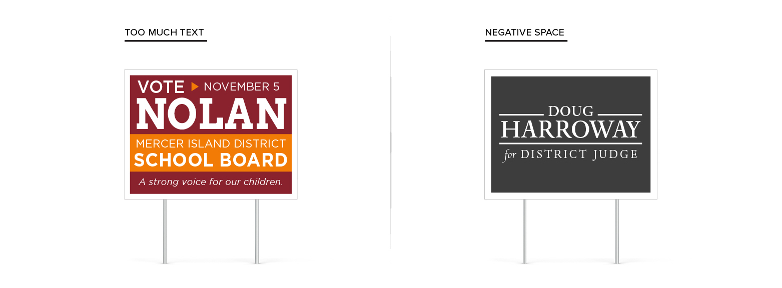
The layout of your content can play a big role in readability. In most cases, you want to shoot for 60% negative space and 40% copy. Like we mentioned above, if you are using lines or other flourishes, make them clean and symmetrical, and don’t let the details dominate your important information.
Design Process
Ok now you know the size you need for your sign locations, you have the layout and colors optimized for maximum readability, and you’re ready to design. If you’re nervous about designing your sign from scratch, start with a template! Templates are a super easy way to make sure you’re on track.
At Signs.com, our design tool is easy to use and you can produce great results right from the comfort of your home or office computer or device. If you have any other questions about your specific campaign sign ideas or just want some help creating a great sign, let one of our designers help—it’s free!
Designing your campaign sign can be a cinch, and you’ll secure your position in no time. Follow these handy tips and you’re on your way.
https://goo.gl/hYDEHJ
No comments:
Post a Comment