I have a seven-month-old male Caucasian Shepherd puppy called Fierce. When I started walking Fierce at about three months old, I noticed the all-too-familiar struggle I’ve had with pretty much every dog I’ve owned: a struggle with the leash.
The first time I put Fierce on a leash, there was nothing I could do to get him to walk. He resisted every attempt to get him to move and tried everything to escape the leash. This struggle gradually reduced over time as Fierce got used to the leash. Now, he immediately runs after me anytime I grab it.
But this experience with Fierce reminded me of a concept I learned in Psychology class: neural adaptation (or sensory adaptation).
Have you ever thought about why you no longer feel your clothes or why it eventually feels as if they’re part of you? Or why, though it initially feels different, your shoes feel like an extension of your legs after you’ve worn them for a while?
Most likely, you haven’t thought about it. This is because you’ve gotten so accustomed to the clothes and shoes you wear, you fail to realize the clothes and shoes aren’t extensions of your body.
This is explained by a concept called neural adaptation: a gradual decrease in response to a stimulus due to constant exposure to it. This concept explains why our clothes, shoes, and caps feel like a part of our body and why we feel slight pain when we dip our hand (or body) in slightly hot water but feel almost nothing if our hand remains in the slightly hot water despite its temperature not changing considerably.
We’ve been wired to tune out stimuli -- whether it’s pain, noise, smell, or vision -- after constant exposure to it.
While it’s easy to picture my puppy, Fierce, resisting and struggling when I began to walk him, it might be difficult thinking about how that act might directly apply to your marketing or conversions. Allow me to explain.
Neural Adaptation is Why Red Beats Green
When it comes to copywriting, the debate about which CTA button color is best is one for the ages. Luckily, HubSpot has a landmark study comparing the red and green CTA button color:

Image source: Performable
Many reasons were given to explain why the color red might have outperformed green, but we don’t have to look far to see another example of neural adaptation. Green is the color used in the test.
Users were accustomed to the color green on the page and were likely to tune it out until they no longer noticed it which weakened the effectiveness of a green CTA button. Red stood out, grabbed participant attention, and was more likely to be clicked.
When trying to boost your conversions, understanding neural adaptation can help you more effectively design your pages for maximum ROI. Ready to put all this to use?
5 Ways to Boost Your Conversions Using the Neural Adaptation Principle
1. Make sure your CTA button color stands out compared to your site’s color scheme
When choosing a CTA button color, it’s important to realize what’s most important isn’t whether you use the red, green, or orange button color.
Rather, it’s that your CTA button color stands out in comparison to the overall color scheme and elements of your site/page. A red button on a page with a red color scheme will likely perform poorly. A green button on the same page will likely stand out.
In this review of Bluehost, for example, while the page sports a blue color scheme and screenshots taken from Bluehost’s website also sport the color blue, the CTA button is orange which stands out from the overall look and feel of the website.

Image source: Bluehost
A blue CTA button would have been less effective on this page.
2. Make sure your CTA button is big enough to be noticeable
Often, it isn’t just about your button color. Size matters, too.
After writing many articles on the subject of CTA buttons, Unbounce concluded the best button for conversions is the “Big Orange Button,” or BOB. But instead of focusing on the color, let’s consider the size.
“Smashing Magazine” advocates using a bigger CTA button -- up to 20% bigger than a site’s logo. In a case study involving SAP, WiderFunnel reported a 32.5% increase in conversions and 154% ROI by using a large orange button.
The whole point of neural adaptation is this: don’t let key elements you want users to notice blend in. When you optimize the size of your CTA button, they become more noticeable and users are more likely to click them.
3. Present fewer options for better conversions
In a study observing how shoppers in an upscale grocery store responded to choice, researchers Sheena Iyengar and Mark Lepper found more isn’t necessarily better.
In the study, shoppers were split into two groups: the first group was exposed to a table displaying 24 varieties of jams while the second group was exposed to a table displaying six varieties of jams.
While the table with more jams attracted the attention of 60% of shoppers, the table with fewer jams converted significantly more by a factor of 10 to one, or up to 900%.
Various studies have also found that presenting people with more form fields generally lowers conversion rates. And reducing form fields can boost conversions. In fact, one study found reducing form fields can increase conversions by up to 160%.
Present fewer CTAs, form fields, and requirements. This way, the options that are most important stand out and conversions go up.
4. Ensure your social proof elements stands out
In one of my recent articles about the bandwagon effect, I shared a case study involving a split test conducted by comScore, an Internet analytics company.
For its test, comScore focused on optimizing customer testimonials and used three variations:
- The original copy: Displayed a vertically aligned testimonial with no logo
- The first variation: Displayed a vertically aligned testimonial with a logo
- The second variation: Displayed a horizontally aligned testimonial with a logo
- The third variation: Displayed a horizontally-aligned testimonial with a logo
Each variation using a logo significantly outperformed the variations without a logo -- and the reason isn’t far-fetched: The logo helped the testimonials stand out, keying into the neural adaptation principle.
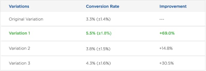
Image source: Optimizely
It’s important that your social proof elements stand out; this means they should include logos/pictures, be bigger, and be bolder.
5. Optimize your pricing to ensure your desired package stands out
There are two ways to use neural adaptation to optimize your pricing page:
Option 1: Use decoy pricing
In his famous decoy pricing experiment, psychologist Dan Ariely surveyed 100 of his students at MIT and asked them to choose between the following two options:
- Web-only subscription -- $59
- Print and web subscription -- $125
68% chose the cheaper $59 option, while 38% chose the expensive print and web option.
The option Ariely really wanted to sell was the print and web subscription, so he tweaked his offer to include a decoy; he added a third option, the “print-only subscription,” for the same price as the print and web subscription.
- Web-only subscription -- $59
- Print-only subscription -- $125
- Print and web subscription -- $125
The result was stunning. 84% chose the print and web subscription and 16% chose the web-only subscription.
What changed? Ariely’s introduction of the decoy option disrupted things and made the actual option he wanted people to pay attention to stand out.
Option #2: Leverage the compromise effect
Take a look at this pricing from Aha!:
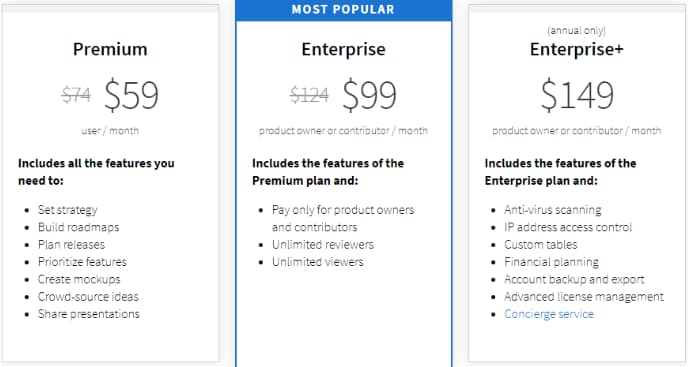
Image source: Aha!
See how the Enterprise plan stands front and center? It’s a compromise between the Premium plan and the Enterprise+ plan, and it is the option Aha! really wants to sell.
Not only is it strategically placed in the center, but both the options and the pricing indicate a compromise between the cheapest and most expensive plan. The blue overlay and the “Most Popular” text draw attention to it. As a result, it stands out compared to the other options.
What Blends in Gets Ignored
The point of neural adaptation is what stands out get noticed and what blends in get ignored. Make sure to focus special attention on elements you want readers of your pages to notice using one or more of the above principles.


No comments:
Post a Comment